Voluum — Case study
Side Navigation Redesign. Clarity for experts and newcomers alike.
A long-lived ad-tech platform, two products sharing one cluttered panel, and expert-only features intimidating every new user. The redesign restructured the platform's information architecture — and introduced a culture of evidence-based design along the way.
Context
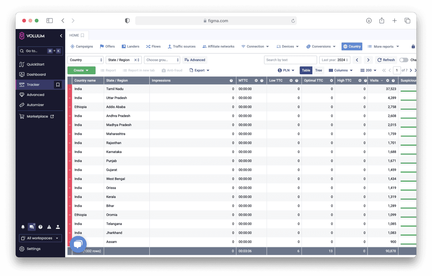
Voluum is used by expert media buyers, and like many long-lived SaaS products it had accumulated legacy complexity. Features were bolted onto the navigation over years, creating clutter and even conflicting flows. Two different products — Voluum Tracker and Voluum DSP — shared the same left-side panel, and with DSP scheduled for sunset, it was the right moment to rework the experience around what Voluum was becoming.
The panel was also hurting acquisition: every expert-only feature was permanently visible, so new users met the full weight of the product on day one.
Problem
- Legacy UI with too many conflicting elements
- Two products sharing one panel — one being discontinued
- Expert-only features constantly visible and distracting
- Overwhelming experience for new users, steep learning curve
- Growing technical debt on the frontend
Internal interviews with customer-facing teams confirmed the hypothesis: advanced users had learned to ignore the clutter, while new users were confused — sometimes intimidated — by it.
Process
- Workshops with developers to evaluate technical feasibility, and with leadership to confirm product direction
- Card sorting with customer success teams and selected clients to validate the structure
- Three IA candidates explored, differing in hierarchy and labeling
- Two rounds of usability testing — first across all three options, then narrowed to two refined versions
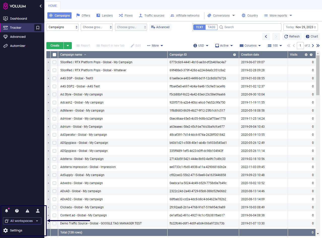
The tension to resolve: discoverability for power users versus clarity for newcomers. The winning version prioritised primary actions, grouped advanced features under expandable sections, and removed redundant items.
Shipped — and public
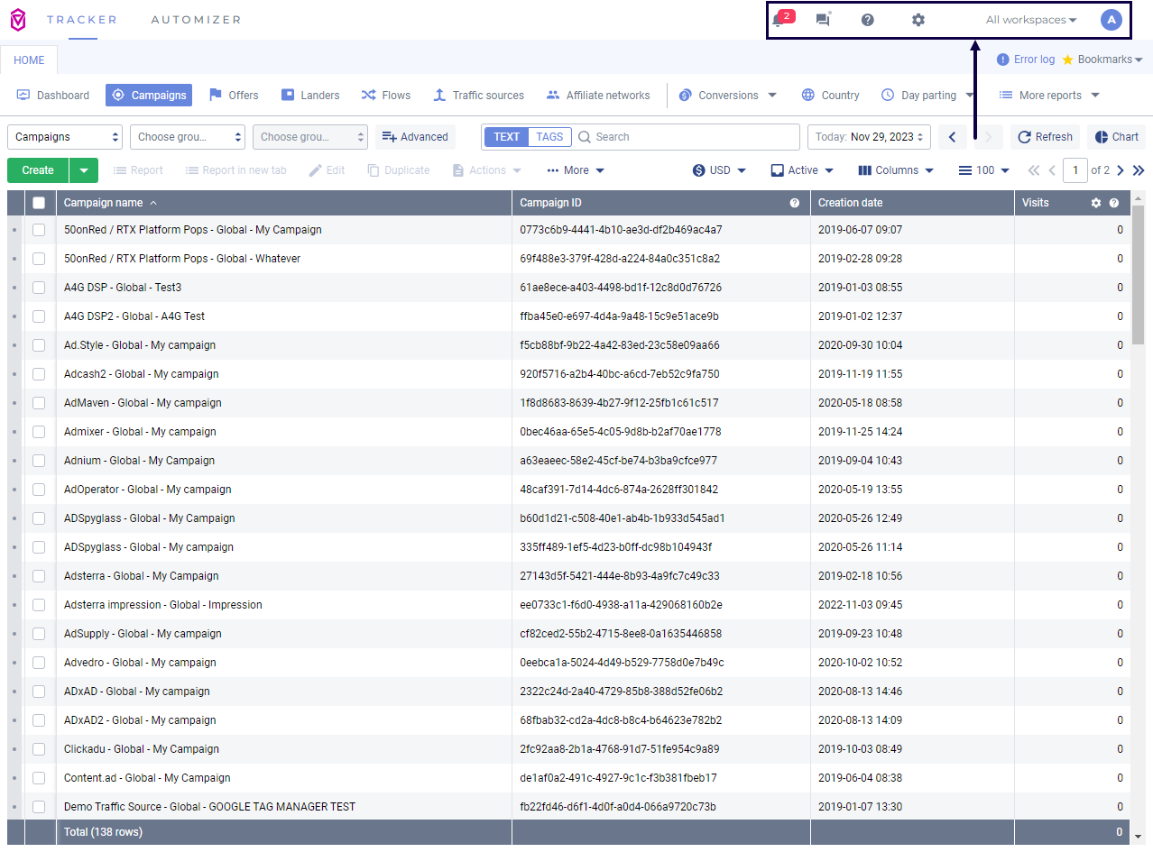
Voluum announced the release as "the biggest redesign of the Voluum interface" in its public changelog, rolled out in batches to the client base, and published a migration guide walking every customer through where their tools moved. The module structure — Dashboard, Tracker, Advanced, Automizer — is still how the product's documentation describes the interface today.
Results
45/46beta users chose to keep the new navigation after one week
+2.1year-over-year SUS score increase after release
3 → 1IA candidates narrowed through two rounds of usability testing
- CS and AM teams reported smoother onboarding and fewer early blockers
- Refactored navigation reduced frontend complexity, enabling faster iteration
- Discovery surfaced feature ideas that still power the product backlog
More than a UI change — from that point on, features earned their place in the interface by proving useful to real users, not by seniority of request.